

The Color Palette is considered one of the most unutilized segments in filmmaking. How come? At the beginning of filmmaking, black and white textures covered the whole frame. Directors of that time never bothered about creating an exact palette for their films. Based on this foundational idea, long after color was introduced in filmmaking, many directors failed to explore this section. Today, we are going to discuss how creating a color palette for your film can benefit your filmmaking skills. But before proceeding further, we need to explore some concepts in color theory.
What Is The Color Theory In Filmmaking?
It is considered that there are certain tones of color in filmmaking that intrigue the audience to feel the ambiance of the particular shot. The manipulation of such color hues can benefit the director greatly in convincing the audience of the story or the plot. Just like when a “cool” tone of color is used, it is to create a gloomy atmosphere. Again, when the “warm” tone is used, it is to persuade the audience with an earthly vibe. The warmer tones used in ‘Blade Runner 2049’ left the audience with the idea of intensity in the plot. Even Matt Reeves, in his “The Batman,” used the red color tone to provide enough foundation for the imminent threat and fear.
What Is The Significance Of Using A Color Palette In Your Film?
From the beginning of the day to the time when you keep your phone on the side before going to bed, every color speaks a different story. Color contains the phonetics of your story. If you treat your frames with a color palette, it will pique the interest of the audience. It is inevitable that the audience will feel relieved if you use a certain color palette. Why? Let’s take some examples to provide you with enough resources to understand the significance a color palette can bring to your film.
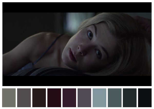
In David Fincher’s “Gone Girl,” you can see the brilliant transition of color from light to dark in most of the frames. Why would he do that? As we said earlier, each color speaks a different story. Here, in this frame, the formation of Amy Dunne, the psychological shift of her desire, is brilliantly portrayed through the color palette. The change from light to dark, that too; the dark tone is vibrant at the end of the frame. Her eyes are in a light grey tone to provide the least emotional aspect of all. The darkness of the frame is basically the approach of the film. The audience starts to corner themselves with the darkness that covers the frame. Now, you can understand how the color palette can be significant for your film. Not sure? Well, let’s pick another example.
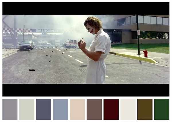
Christopher Nolan is known for his mastery of crafting a perfect yet unique color palette in his films. In “The Dark Knight,” he used a brilliant color palette that created a whole different aspect of this theory. If you look closely at this frame, you’ll see how the magnificent storyteller brought the silver lining into this. See, there is green at the right end of the frame, and there is this grey tone on the left side of it. Now, the Joker is facing the left side of the frame. What does it say? Well, green represents the earthly tone, and grey is basically what humanity looks like. Now, there is a little mastery, where Christopher Nolan puts it. He placed Joker right between these two. What does that give us? The void stands between the lies and the truth. The Joker smirks at the truth and turns his back on the lies. The earthly green hides the lie beneath the humane grey. It works like a screen that stands in front, intending to neglect the lies fed to humanity, which is that the earth is a better place. He stands and proclaims the destruction, as in the very next scene, the green is destroyed by him. See the brilliance of the color palette now? It’s always a fun thing to talk over a cup of coffee.
Essential Tips To Implement A Color Palette In Your Film
As you now know the significance of using a color palette in your film, we can now provide you with some tips on how to use it.
Use of Color Discordance: Remember Steven Spielberg’s “Schindler’s List”? There was this little girl in a red pullover running around in the black and white frame? That is called color discordance. You can use it to draw the attention of the audience to a particular subject. It would help you derive your plot comfortably and tell your story more directly. This technique is primarily helpful in monochromatic frames. You can use one or two colors of discordance in a single frame to make the audience look at whatever you want them to.
Use Complementary Colors: Complementary colors are the ones placed exactly opposite each other on a color wheel. For example, red is complementary to green, and purple is complementary to yellow. Using complementary colors at large provides color harmony altogether. Color harmony helps create a pleasing ambiance for the audience without using discordance. Color harmony is soothing for the eyes of the audience. Woody Allen mostly uses this kind of color palette.
Analogous Color Schemes: Colors that fall next to each other in a color wheel are called analogous color schemes. For example, red and orange or sky and blue. When you intend to use analogous color schemes for your frame, it gives you uniformity in a color palette. Uniformity always puts the audience in a somber ambiance. It also helps you improvise a sense of serenity in the frame.
Triadic Color Schemes: When you select three different colors and highlight them above all in a color scheme, then it is called a triadic color scheme. You can always find the essence of it in films where intensity plays a much larger role. In ‘Blade Runner 2049’, the use of a triadic color scheme is brilliantly vibrant. The use of red, yellow, and orange in most of the frames helps the intensity of the frames. Even in superhero movies, we can see the use of a triadic color scheme. However, this technique is less considered in today’s filmmaking.
Hire a Colorist: If your film has a budget, then without any hesitation, hire a colorist. A colorist understands the grammar of using colors based on where and when. You can always add color in the process of color grading in post-production. Depending on your eyes is one thing, but viewing through the experience always adds more to it.
So, this is it regarding the color palette. The color palette and the movie colors are not so different in filmmaking. The color palette is the full range of colors that are shown in a frame, whereas in a movie, color sets the tone of the film itself. If you are still in any doubt, drop your query in the comment box.
See More: How Can Film Be A Language? What Is The Language Of Film?